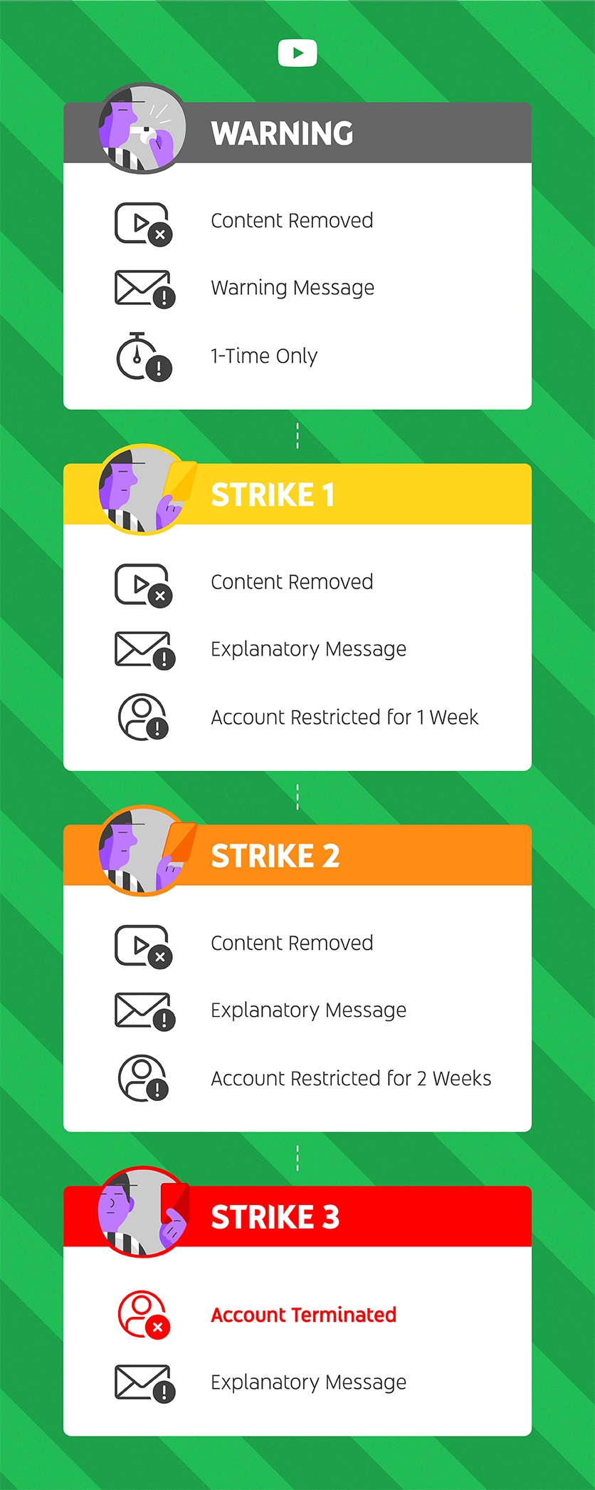
I really REALLY like the way this information from youtube.com explains their policy. As I read it, I found the words to be engaging, without demanding extensive deciphering of intent and the graphics pleasing to the eyes. I sincerely believe that if all documentation, whether the intended audience is a customer or a fellow co-worker, had always conveyed the intended message in a manner like the text below, there would not be a "no one reads the documentation" mentality surrounding my profession as a technical writer. In a short 341 days (11 months, 4 days) , I will reach the milestone of working as a professional technical writer for 25 years. I hope that the documentation I have been involved in during the past 8790 days (24 years, 3 weeks, 3 days) can be judged to be helpful to the audience. Then again, why would anyone want to write confusing documentation?
WHAT’S NEW
|
Making it easier to play by the rules.
|
We heard you, so we simplified the Strikes system to focus on
consistent enforcement, clear policies, and more transparency. We’ve also
added a new one time warning so you can take time to learn about the new
system and keep creating without interruption. Talk about a win-win. Watch the video here. |
|
|
Editor's Note: My oh my... slipping, eh? The words and the graphics are nice, but look harder. The person in the icon within the title bar of each graphic is a
non-baseball umpire while the phrases "Strike 1", "Strike 2", and
"Strike 3" are clearly associated with baseball. Without stereotyping too much, I wonder if the Graphic Design major who created the images and graphics knows that there are no strikes in any sport except baseball.

No comments:
Post a Comment